
Emmanuelle
Moureaux
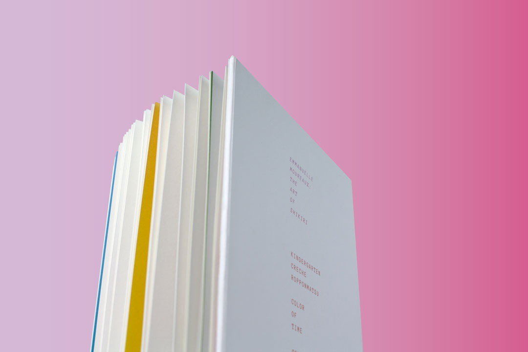
The Art of Shikiri
Emmanuelle Moureaux: The Art of Shikiri is a dual-language English-Japanese catalogue designed in conjunction with an exhibition in Tokyo featuring artist, architect, and designer, Emmanuelle Moureaux’s work exploring color in space of the past 15 years.
Typography
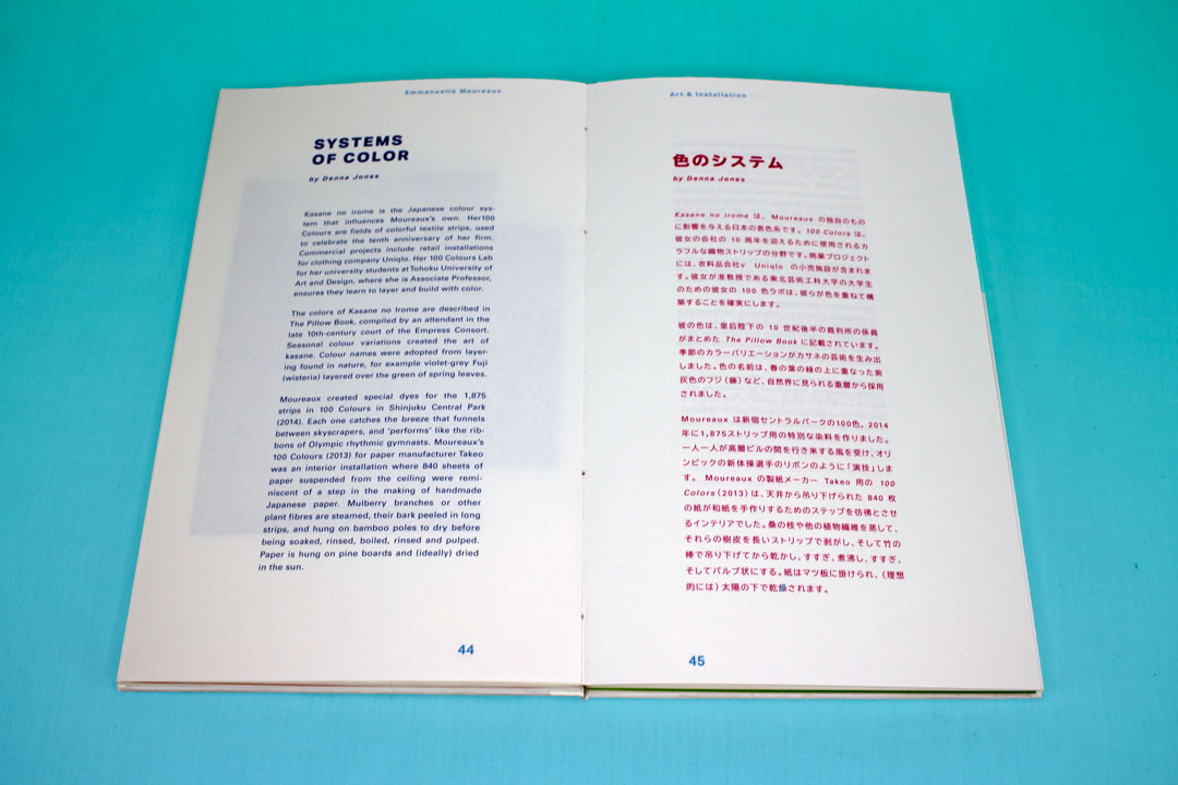
Univers | English headings, English body copy, folios
Released in 1957 by Adrian Frutiger, the Neo-Grotesque sans-serif typeface is known for its multitude of weights which was useful in pairing with TUBDGothic. Univers serves as a neutral face in both heading and body-presenting layouts.

TUBDGothic | Japanese headings, Japanese body copy
Chosen for its minimalist appearance, the typeface’s streamlined angles pair marvelously with Univers and Moureaux’s more structural work.. The two typefaces fit seamlessly together even as Univers takes the place of English type inputted into the Japanese body text.

Anonymous Pro | details, specifications, captions
Anonymous is named so for its both typewriter-esque appearance and its more technical style. The typeface was chosen for specifications and work details in the book because it stands back and appears more technical as a monospaced typeface.

Form
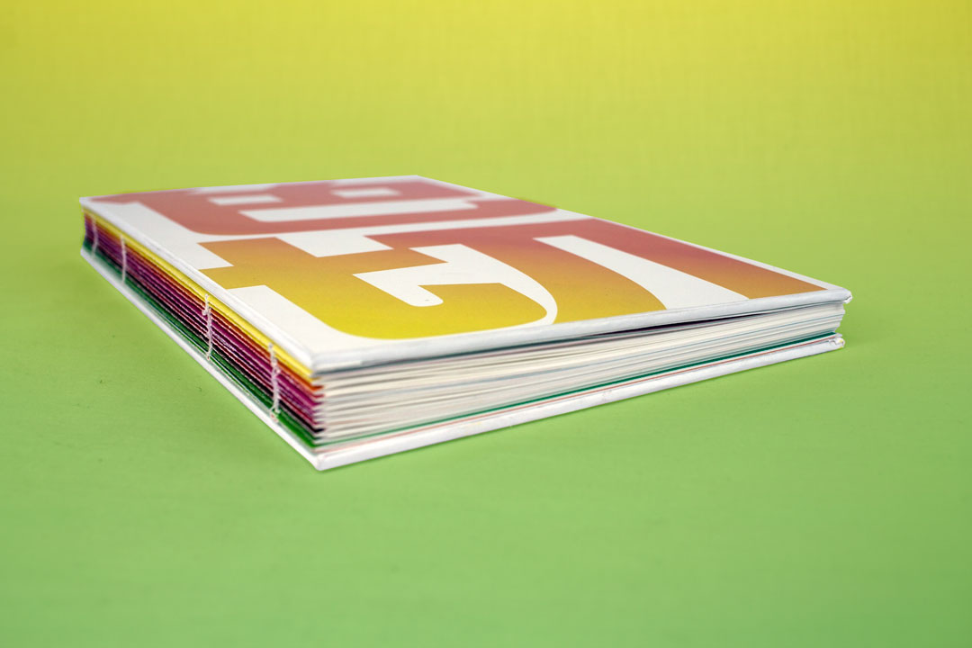
The catalogue is designed employing the ideology Moureaux coined herself called Shikiri—which translates directly to “space divided by color”. The sections of the catalogue are color-coded and the exposed spine features a spectrum of colors pulled from Moureaux’s work along the signatures. Similar also to her work, the publication’s only use of black is found on the colophon page.