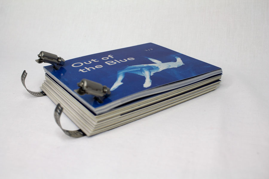
Out of
the Blue
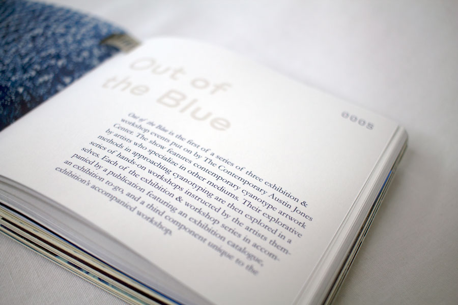
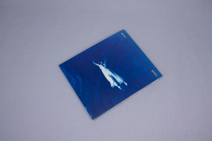
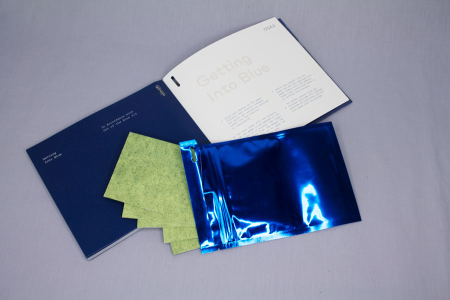
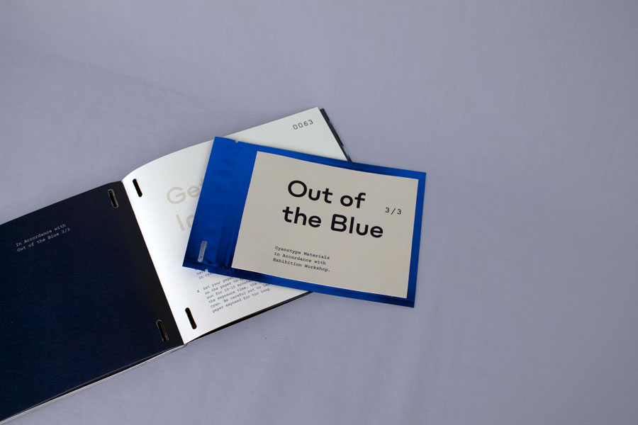
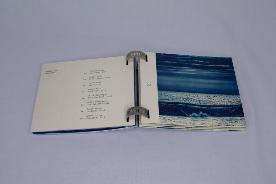
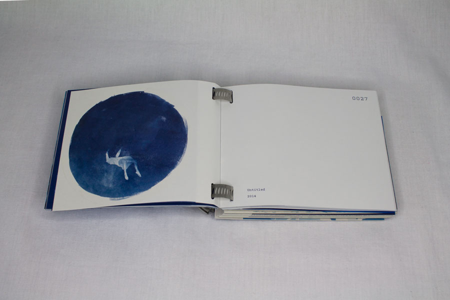
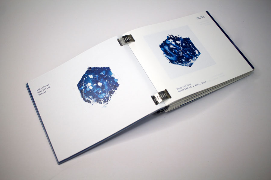
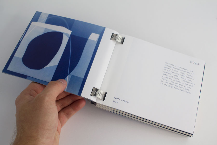
Out of the Blue is the first of a series of three exhibition-and-workshop events put on by the Contemporary Austin Jones Center. The show featured contemporary cyanotype artworks by artists who specialize in other mediums. As a part of the show attendees are offered a workshopping opportunity to create their own cyanotypes—instructed by the artists themselves. The publications serve a triple purpose: as an exhibition catalogue, a manual of cyanotyping, and an in-bound set of ready-to-use cyanotype paper.
Typography
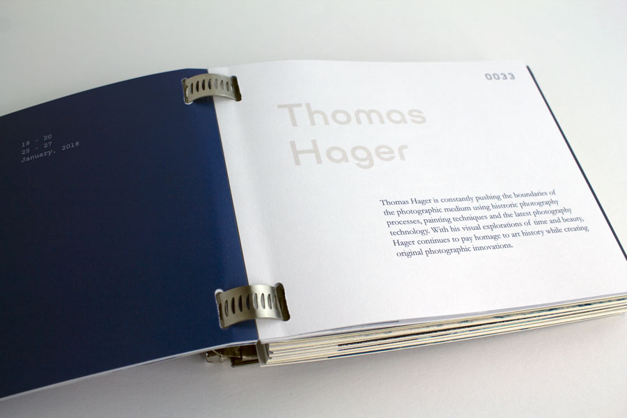
Ulm Grotesk | title, section headers
This geometric typeface was chosen as a display face. Designed by Ilya Naumoff for the Indian Type Foundry, Ulm is meant to imitate the round and industrial essence of the hose-clamp binding—a choice made to call back to the more modulated and calculated approach that cyanotyping requires.
Adobe Garamond | body copy
Designed by Robert Slimbach for Adobe Systems, Adobe Garamond was chosen to serve as main body-text in this publication to reference the era when cyanotypes were used early on as a precursor to what we know as modern photography, which was a time close to when the initial version of Garamond was designed by Claude Garamond.
Kettler | artists’ thoughts, captions
Kettler, designed by Eric Olson for the Process Foundry, was selected for its contrasting modern angular curves and monospaced uses for specifications and less-colorful language. The typeface features segmented letterforms with rounded edges, leading to an interesting aesthetic that I felt mimicked the essence of cyanotyping as an art form.
Form
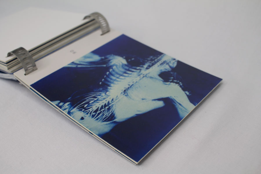
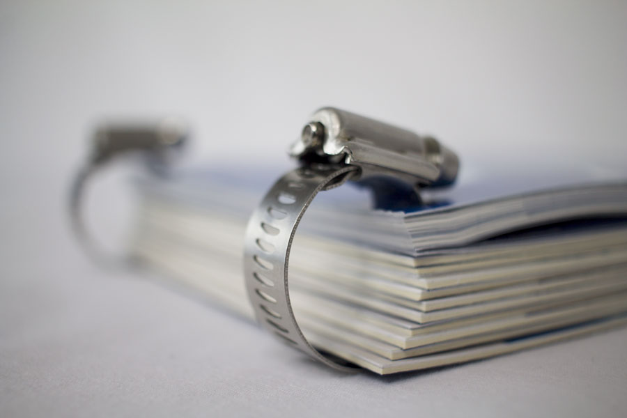
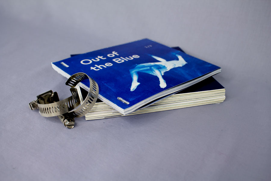
Out of the Blue as a set is bound in by a unique binding method I call clamp-binding. Holes are punched through the catalogue as well as through the panels of exhibition works. The clamps not only provide a binding element, but also reference the industrial and more segmented processes that come with cyanotyping.


