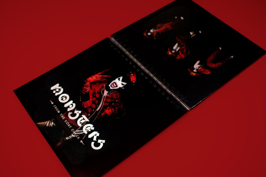
Monsters
from the
Coat Check
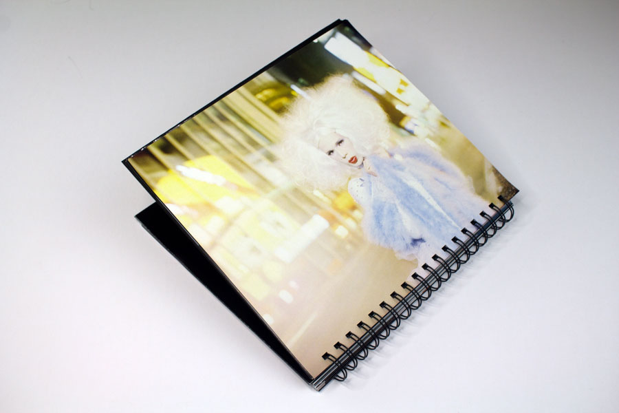
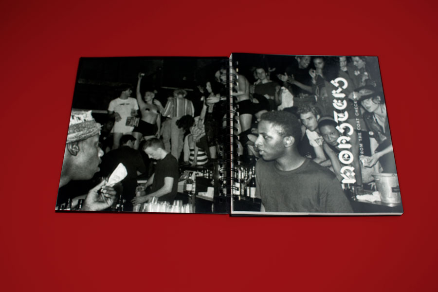
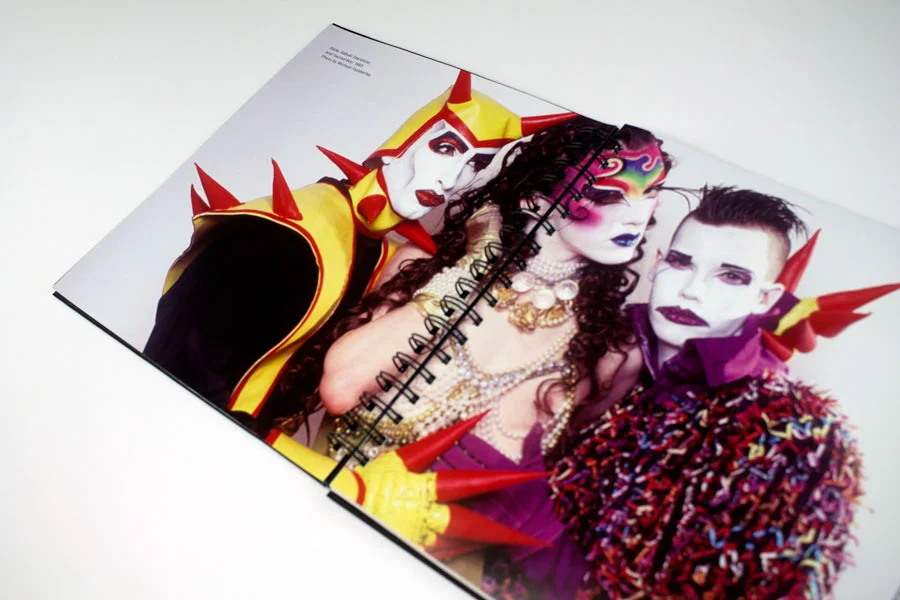
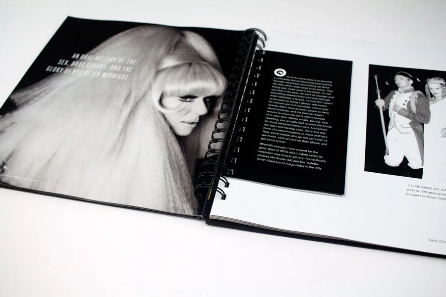
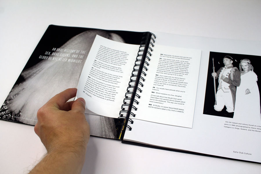
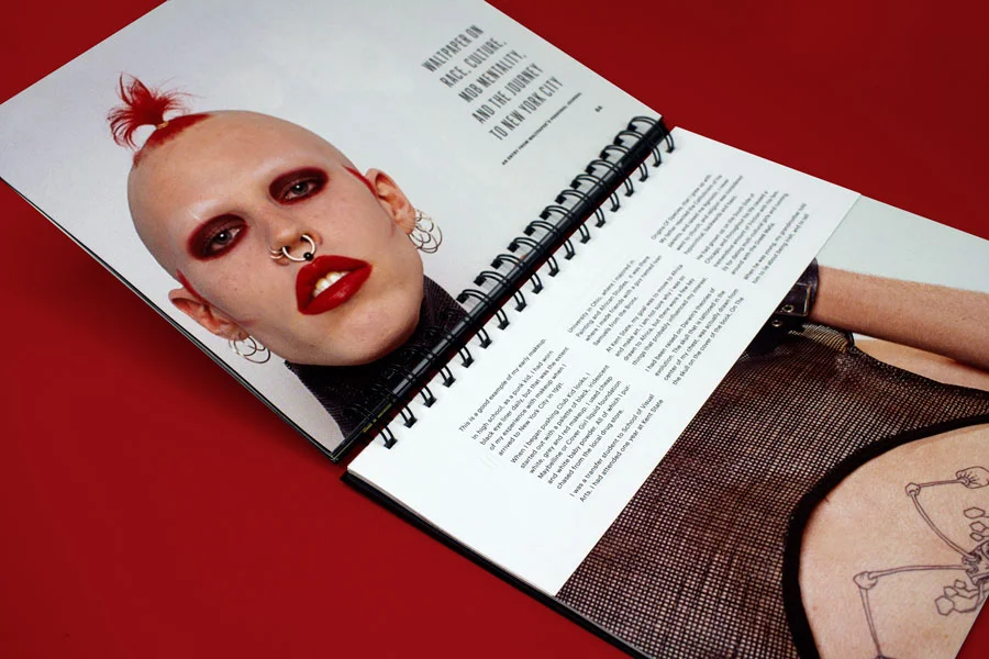
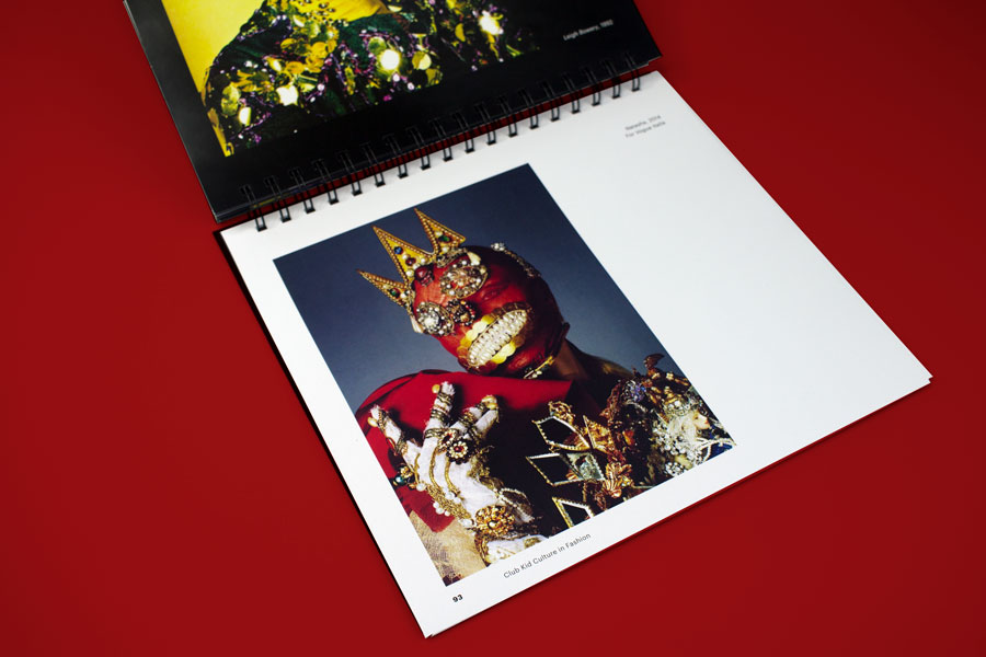
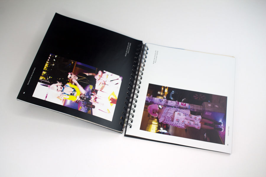
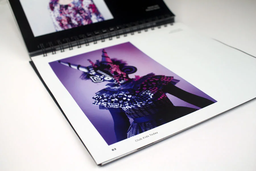
Monsters from the Coat Check is a look-book observing the history and lasting influence of the Club Kids of New York City since the 80’s. Alongside the photography, the publication features oral histories, interviews, and articles by influencers of the sub-culture.
Typography
Graphik | body copy, folios, captions
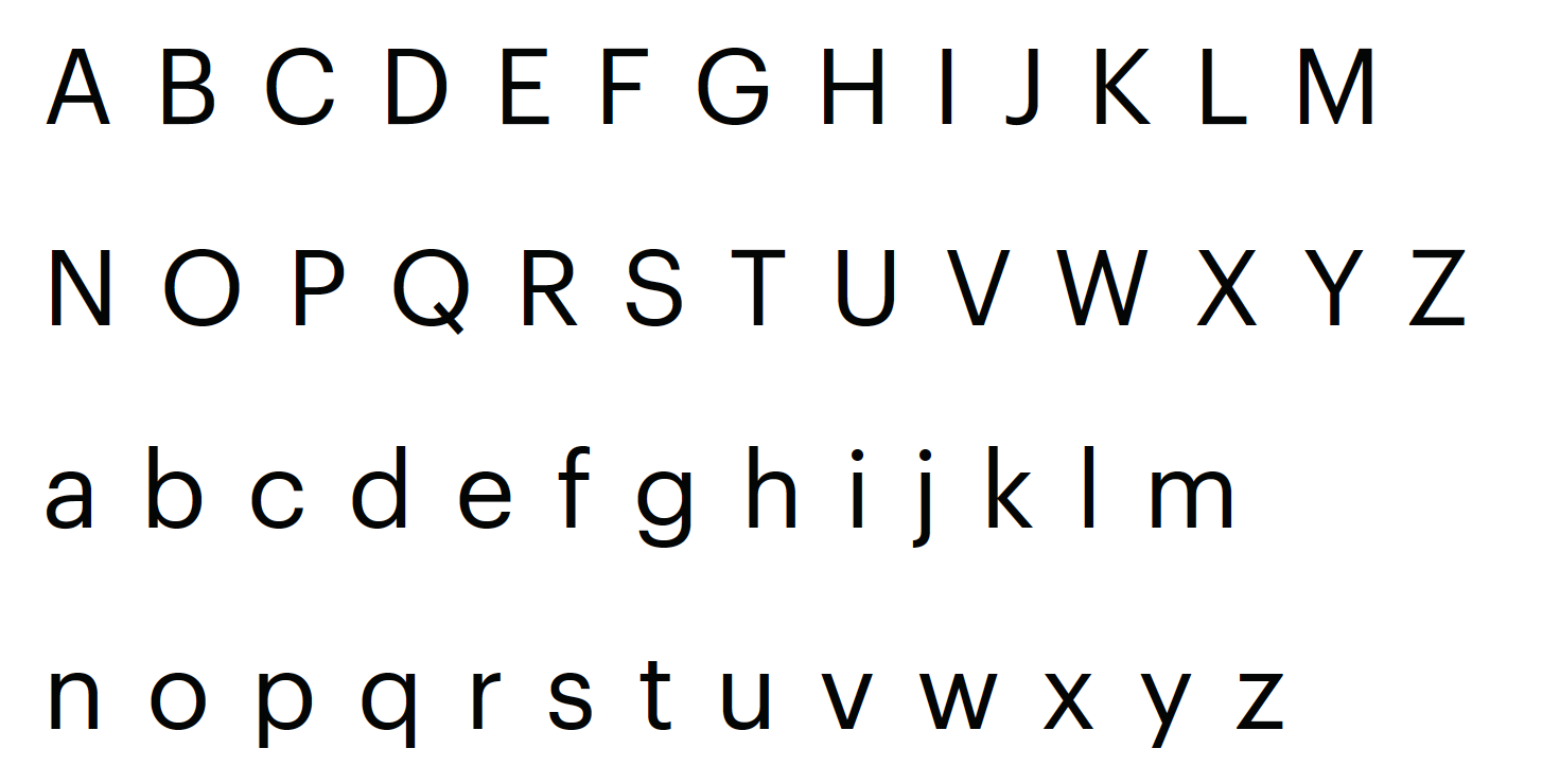
I chose Graphik (a neo-grotesque sans-serif typeface) based on its creation in 2009 at the tail end of the Club Kid era. I felt the typeface was a neutral typeface to be paired with an elaborate dis-play typeface. Graphik was designed by Christian Swarz for Commercial Type Foundry. I used Graphik for all body text and folios throughout my book.
Graphik Condensed XX | titles, drop quotes, sub-headings
I employed Graphik’s new Condensed XX version to serve as sub-headings and to fit in the more vertically oriented typographic situations. Most titles and drop-quotes are set in Graphik Condensed XX. The drop quotes often would feature a drop cap in Bastard.
Bastard | display typography, drop caps
I used Bastard for display text and the cover of the book. I included this blackletter typeface as an homage to the clubs in New York City that were often renovated out of abandoned chapels and churches. The typeface is also named “Bastard” in part by that it was created based off traditional black letter fonts made using modern software, making it the first black letter typeface generated on a computer in the 1980’s. This merging of influences and cultures related to the grungy nature and lifestyles of the Club Kids. This monstrous typeface conveyed the essence of the costume-esque fashion and makeup that the Club Kids dressed in.
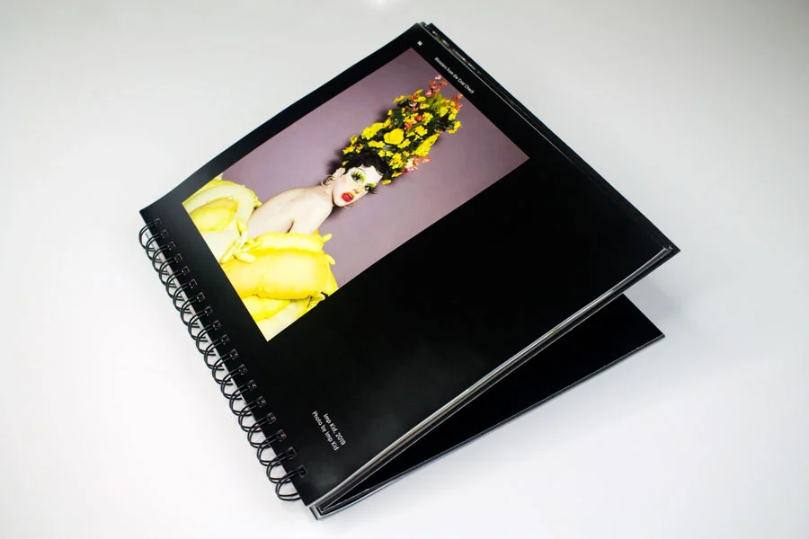
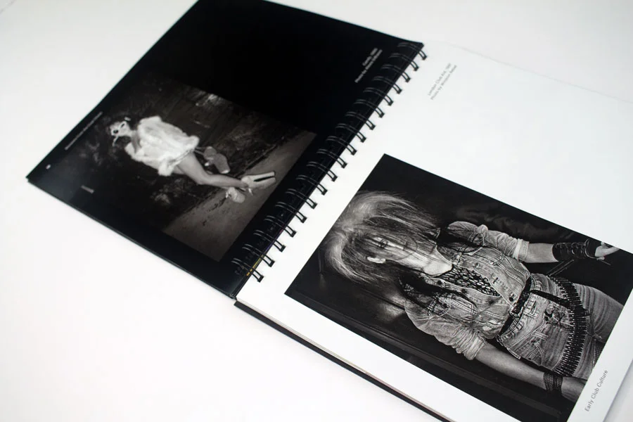
Form
Monsters from the Coat Check is top-bound as I wanted the book to be more explorative in nature. Ideally the book isn’t to be held, but rather splayed out on a table with its viewer flipping between pages and digesting the bizarre imagery of the influential Club Kids and their fashions. Different page sizes and in-bound photographs are meant to seize the viewer’s attention to take a moment and focus on what the individual is expressing. The unpredictable nature of the publication is meant to mimic the patterns Club Kids followed in striving to keep their observers on edge and interested week-after-week.